



Avoid Proof Rejections: Stamp Artwork Preflight for Makers & Shops
Vector artwork (AI, EPS or PDF) is the standard suppliers want. If you’re stuck with raster, it needs 300 to 600 dpi at final size. Everything must render in pure black and white, with no greys, gradients or drop shadows. Fonts should be converted to outlines and sized appropriately, line weights kept above minimum limits, and design created at actual stamp size including trimming margin. Expect a digital proof before anything goes to production.
TL;DR:
- Use vector formats like AI, EPS, or PDF for scalability, and ensure raster files are 300 to 600 dpi at final size to maintain quality.
- Keep text at least 14pt for reverse type and avoid lines thinner than 0.25pt to ensure readability and clean cutting.
- Convert all fonts to outlines, expand strokes, and embed images to prevent substitution errors during production.
- Design at the stamp’s actual final dimensions, leaving margins to prevent trimming important details or cut-off edges.
- Order a test stamp from prototypes to verify that tiny details, fine lines, and reverse type remain clear after reduction.
Table of Contents
- What file formats do stamp makers accept?
- How small can text and lines be on a stamp?
- How do you prepare a file so nothing gets substituted?
- How should you name, upload and check your files?
- What usually goes wrong, and how do you fix it?
- What does the trade actually do before ordering?
- Should you outsource the stamp or make it yourself?
- Want to make stamps yourself instead of ordering them in?
- Why do so many stamp orders still fail at proof stage?
- Sources
What file formats do stamp makers accept?
Vector files sit at the top of every supplier’s wish list, and for good reason. AI, EPS, SVG and PDF files scale cleanly to any size without losing edge sharpness, which matters because a design that looks crisp on your monitor can turn to mush once it’s reduced to a 40mm stamp face. A true vector PDF built in PDF/X format is close to the gold standard, since it locks fonts and colour settings in a way that travels well between design software and production machines.
Raster formats work too, but they come with conditions. TIFF, PNG and JPEG files are all acceptable, provided the resolution holds up:
- A minimum resolution suitable for print quality at the final size is required
- Higher resolution is preferable if the stamp or any fine details are very small
- Avoid enlarging low-resolution images as this results in poor quality
If you’ve only got a raster logo pulled from a website or an old business card, ask the supplier about vector conversion before you submit anything. Conversion works best from a clean, high-contrast source image. A blurry scan or a screenshot with compression artefacts gives the tracing software very little to work with, and the converted file will inherit those flaws.
How small can text and lines be on a stamp?
Stamps are unforgiving in a way most print jobs aren’t, because there’s no colour gradient or anti-aliasing to hide a rough edge. Ink is either there or it isn’t. That binary nature is exactly why official duck stamp design guidance stresses contrast, clean composition and enough breathing room for lettering to survive reduction.
A few working thresholds:
- Positive text (black on white): Fonts should be large enough to remain legible after reduction
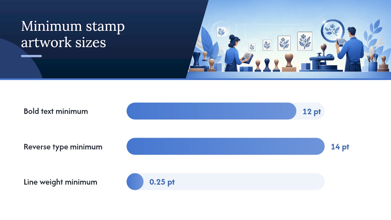
- Bold weights below 12pt tend to clog and blur when the rubber die is cut
- Reverse type (white text cut from a solid black background) needs at least 14pt, since the surrounding ink has nowhere to bleed if the letterforms are thin
- Line weights: thin hairlines under roughly 0.25pt often fail to cut cleanly, so err thicker rather than thinner
- Negative space: Enclosed white spaces inside letters need sufficient clearance to remain distinct
Design at the stamp’s actual final dimensions, not a scaled-up version you’ll shrink later. If a detail disappears on paper, it will disappear on rubber too. The Smithsonian National Postal Museum’s design curriculum makes this same point about stamp design generally: elements that read fine at large scale routinely fall apart once reduced.
Pro Tip: Leave a small margin around the artwork edge before trimming to ensure nothing important is cut off. It gives the maker room to cut cleanly without shaving into your design.
How do you prepare a file so nothing gets substituted?
A supplier’s production software won’t have your fonts installed, and it definitely won’t guess which weight you meant. Cleaning the file before export removes that guesswork entirely.
- Convert all text to outlines (paths), so the design carries its own shapes rather than relying on a font file the maker may not have.
- Expand every stroke into a filled shape. A 0.5pt stroke that looks fine on screen can render as a broken hairline once expanded incorrectly on someone else’s system.
- Check every fill is pure black, not a near-black like C0 M0 Y0 K95 or a dark grey that photographs as black on your screen but scans as tone.
- Embed all linked images at full resolution rather than leaving them linked externally, and keep your original layered files on hand in case the supplier needs to renegotiate a tricky separation.
- Export as PDF/X-1a where the software allows it, or supply a clean EPS/AI file if the job involves complex vector paths that need to stay editable on the production end.
How should you name, upload and check your files?
A clear file name saves everyone a round of emails. Something like OrderNumber_StampName_45x20mm.pdf tells a production team the order, the design and the final size before they’ve even opened it.
- Note the exact final dimensions and any margin requirements in the order comments, not just in the file itself
- Flag ink colour or handle-type preferences if they’re not obvious from the artwork alone
- On the digital proof, check spelling first (it’s the most common miss), then line integrity, alignment and whether any fine detail has been simplified away
- If an upload tool times out or rejects your file, email the order number along with the artwork or a file-share link as a backup route
Suppliers generally send a proof stage precisely because it’s the last checkpoint before a die is cut. Read it properly rather than rubber-stamping the approval.
What usually goes wrong, and how do you fix it?
Most stamp complaints trace back to a small handful of repeat offenders. A detailed breakdown of common design mistakes points to the same culprits over and over: screen-resolution images, gradients, and text that was never meant to be read at 6pt.
- Low-res raster images: rescan at 300 to 600 dpi, or ask about vectorisation before you resubmit
- Fine details collapsing: thicken the stroke weight or simplify the shape rather than fighting the resolution
- Gradients and drop shadows: convert everything to solid fills. A stamp can’t print a shadow because it can’t print a gradient of ink
- Reverse type disappearing: bump the font size up or add letter spacing so the ink has somewhere to sit
A practical supplier design guide makes the same point about the binary nature of the ink and no-ink surface: there’s no halftone option to fall back on, so every effect has to become a solid shape before it leaves your file. Keep a short printed checklist by your desk (format, resolution, black fills, outlined fonts, correct size) and run through it before every order.
What does the trade actually do before ordering?
Working stamp shops follow roughly the same five steps every time: pick the stamp type and size, design at that exact size, preflight the file (outline fonts, expand strokes, embed images), export with clear notes attached, then upload and check the proof properly before approving it.
- Choose the stamp type (self-inking, pre-inked, traditional) and confirm dimensions first
- Build the design at final size, not scaled
- Preflight: outline fonts, expand strokes, embed images
- Export as PDF/X or clean vector, with size and ink notes attached
- Upload, then check the proof line by line before signing off
Manufacturers often simplify tiny serifs, thin gradients or fine photographic detail automatically, because the rubber simply can’t hold them. Note in your order comments which details matter most, so the shop knows what to protect rather than trim. For a fuller walkthrough, the step-by-step stamp making guide covers the same workflow in more depth, and a raster-to-vector conversion service is worth asking about if your only source file is a logo pulled from an old letterhead.
Pro Tip: Order one sample stamp before committing to a large batch design. A physical impression on paper shows flaws that a screen proof simply won’t.
Should you outsource the stamp or make it yourself?
Outsourcing suits one-offs, small runs, and jobs where you need a production-ready die fast without owning the equipment. In-house production earns its keep once you’re running repeat batches or building a custom workflow around your own machines. Ask yourself: how often will you need this? How much control over turnaround do you actually need? Answer those honestly and the decision usually makes itself.
Want to make stamps yourself instead of ordering them in?
If the answer to those questions points towards doing it yourself, the equipment side is more approachable than most people expect. A dedicated stamp-making machine handles the cutting and mounting stage without needing a factory setup, and laser-engraveable blanks give you a consistent, ready-to-mount base instead of trial-and-error rubber sheets.
Running your own line means you control turnaround completely and can turn around a rush order the same afternoon instead of waiting on someone else’s queue. Subliblanks stocks the stamp-making machines and blanks that support that kind of workflow, alongside the inks and pads that finish the job, and there’s no minimum order quantity holding you back if you want to start small and scale up. If you’re weighing which machine suits your volume, the stamp making machine guide breaks down the options by output and budget. Browse the current range and work out what a starter setup would actually cost you.
Why do so many stamp orders still fail at proof stage?
Most rejected stamp artwork isn’t rejected because the designer didn’t know the rules. It’s rejected because those rules get applied at the wrong scale. Someone designs a beautiful logo at 300mm across, drops in a subtle drop shadow because it looked flat without one, then submits it for a 25mm stamp and wonders why the proof comes back looking like a smudge.
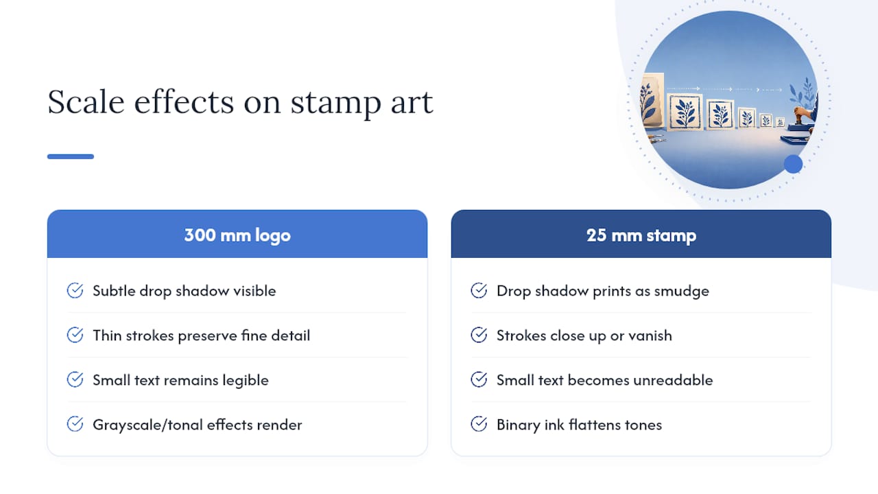
The uncomfortable truth is that stamp design is closer to icon design than to logo design, and most people approach it the wrong way round. A logo gets refined at large scale and then shrunk. Good stamp artwork gets built at final size from the first line you draw, because that’s the only way you’ll notice a counter closing up or a stroke disappearing before it costs you a wasted die.
The other thing conventional advice tends to skip: pure black and white isn’t a limitation to work around, it’s the entire design language. Fighting it with near-black fills or faint tonal effects doesn’t make the stamp look more sophisticated. It just makes the proof stage longer. Once you accept that a stamp is a binary medium, ink or no ink, the design decisions get considerably easier to make.
— chris
Sources
- Design It: full curriculum — Smithsonian National Postal Museum
- What makes a good stamp design? — U.S. Fish and Wildlife Service (duck stamp guidance)


