


How printers drive impact in merchandising displays
TL;DR:
- Printed displays are essential for guiding customer choices at key decision points like checkout, serving more as conversion tools than mere decoration. Small businesses often overlook the importance of coordinated merchandising systems, testing proofs in store conditions, and choosing suitable substrates to ensure impactful, readable displays. Implementing a structured workflow, verifying artwork accuracy, and considering environmental factors can significantly enhance the effectiveness of retail print strategies.
Walk past any busy checkout queue and you will notice something most shoppers never consciously register: printed displays are silently doing the selling. Banners, POS graphics, shelf talkers, and product badges are not decoration. They are working hard at the exact moment a shopper is weighing up a purchase. Yet many small business owners in the UK and Ireland still treat printed display as an afterthought, commissioning it last and proofing it never. This article unpacks why printers sit at the heart of effective merchandising strategy and what practical steps you can take to make your printed displays genuinely earn their place on the shop floor.
Table of Contents
- Understanding merchandising prints: More than decoration
- The printer’s role: From artwork to impact
- Designing for visibility: Merchandising systems in action
- Practical merchandising tips: Maximising display impact
- What most guides miss about merchandising print strategy
- Enhance your merchandising with SubliBlanks
- Frequently asked questions
Key Takeaways
| Point | Details |
|---|---|
| Prints drive decisions | Printed displays influence shoppers most at decision points such as checkouts. |
| Proofing is essential | Colour, substrate, and mounting checks prevent costly errors in store displays. |
| System approach wins | Integrated merchandising systems perform better than standalone posters. |
| Lighting matters | Testing prints under actual store lighting and conditions ensures impact. |
| Collaboration required | Creative and technical teams must work together for success in merchandising prints. |
Understanding merchandising prints: More than decoration
Most people think of retail print as wallpaper. Something colourful to fill empty wall space or signal a promotion in a vague, general way. That thinking costs businesses real money.
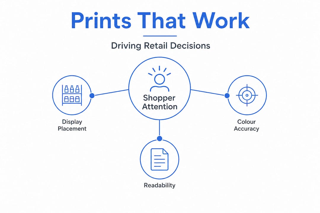
Retail merchandising print is used to create visibility at shopper decision points, especially at checkout, and works best as part of a coordinated system rather than a collection of standalone posters or displays. That distinction matters more than it might first appear. A single poster pinned to a wall is easy to overlook. A system of coordinated graphics, each placed at a specific stage of the shopper journey, guides a customer from initial awareness through to purchase decision without them realising they are being guided at all.
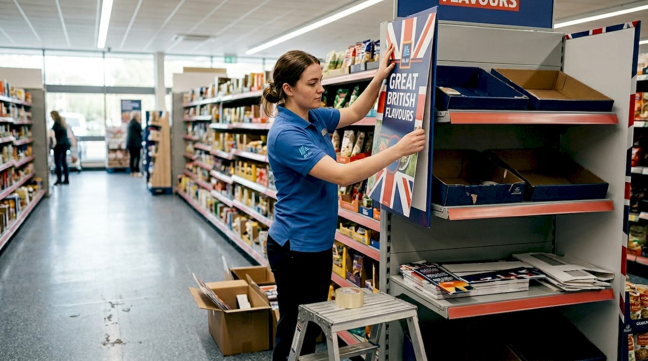
Think about what happens at a checkout counter. A shopper has already committed to entering your store and selecting a product. Their attention is focused, they are stationary for at least a few seconds, and they are in a purchasing mindset. A well-placed, instantly readable printed display at that moment does not just build brand awareness. It can prompt an impulse addition to the basket, communicate a loyalty offer, or highlight a complementary product. That is a conversion tool, not a decoration.
Key differences between standalone prints and merchandising systems:
- Standalone prints exist in isolation with no defined journey for the shopper
- Merchandising systems use coordinated placement, consistent visual language, and sequential messaging
- System-based prints are designed to be understood in under three seconds from typical viewing distances
- Standalone prints often focus on aesthetics; systems prioritise readability and action
The impact of printer innovation on small business merchandising has been significant precisely because it now gives independent retailers the ability to create professional, system-based displays without large production budgets. What was once only accessible to major retail chains is now within reach of a market stallholder or a small independent boutique in Cork or Cardiff.
“The difference between a display that gets noticed and one that gets ignored often comes down to placement and purpose, not print quality alone.”
Instant readability is the standard your prints need to meet. If a shopper has to pause and squint to understand your message, you have already lost the moment. High contrast, bold typography, and a clear single call to action are the non-negotiable building blocks of any effective merchandising print.
The printer’s role: From artwork to impact
A printer is not a machine you hand files to and collect finished displays from. It is the critical bridge between creative intention and real-world execution. And that bridge has several points where things can go wrong.
Print artwork must be proofed and checked for colour accuracy, resolution, substrate compatibility, and mounting method, because real in-store conditions can fundamentally undermine the intended impact of even the most beautifully designed graphic. A design that looks vivid on screen can appear washed out when printed on an uncoated substrate under warm fluorescent lighting. A photo that appears sharp at A4 becomes pixelated when scaled to A1. These are not edge cases. They are everyday realities for anyone producing retail display materials.
Printer output factors that determine in-store display success:
| Factor | Why it matters | Common mistake |
|---|---|---|
| Colour accuracy | Ensures brand colours match real-world expectations | Designing in RGB, printing in CMYK without conversion |
| Resolution | Maintains sharp images at large format sizes | Using low-resolution files scaled up |
| Substrate compatibility | Different materials absorb ink differently | Printing on uncoated stock expecting gloss result |
| Mounting method | Affects final flatness and longevity | Ignoring bleed areas causing white edges after mounting |
The substrate question is particularly important for merchandisers working with products like badges, shelf talkers, and POS displays. Sublimation customisation opens up material options that go well beyond standard paper, including rigid MDF, coated metal, and fabric panels, each of which behaves differently under heat and pressure and requires specific artwork preparation.
A sequential approach to printer-driven merchandising success:
- Define the display’s purpose before designing (awareness, conversion, or upsell)
- Choose the substrate based on durability, location, and finish requirements
- Prepare artwork at the correct resolution, colour profile, and bleed settings
- Produce a physical proof at or near actual size before committing to a full run
- Evaluate the proof under the same lighting conditions as the intended display location
- Identify and solve any printing problems before approving the final production run
- Establish a repeatable workflow that reduces errors for future campaigns
Pro Tip: Build a physical reference library of printed substrate samples from your printer. When a new campaign requires a specific finish, you can match it to a proven sample rather than guessing at the result.
Lighting deserves special attention. Warm overhead lighting can shift perceived colour dramatically, making yellows appear green and reds appear brown. Glossy substrates reflect light sources directly into shoppers’ sightlines, rendering the printed message invisible from certain angles. A well-structured print workflow that includes environmental testing at the proofing stage catches these issues before they become expensive mistakes.
Designing for visibility: Merchandising systems in action
System-based thinking transforms how you approach every individual print in your display. Instead of asking “what should this poster say?”, you ask “what is this poster’s role within the wider shopper journey?” That question changes everything, from layout to substrate choice to placement height.
A merchandising system approach means designing posters and POS graphics to be readable and understood instantly from typical shopper sightlines and within your store’s specific lighting conditions. This drives the entire proofing and pre-flight process. You are not just checking that the file prints correctly. You are verifying that the finished display works in context.
Practical system design considerations:
- Map the shopper journey through your space and identify the three to five key decision points
- Assign a specific message to each display position, avoiding repetition across positions
- Test sublimation textiles as an option for banner and hanging display elements, given their durability and vibrant colour reproduction
- Use consistent fonts, brand colours, and layout structures across all system elements
- Account for the typical viewing distance at each position when setting text size and contrast
- Consider how sublimation blanks can extend your display system beyond flat posters into three-dimensional product and fixture elements
Sightlines are one of the most commonly overlooked factors in retail display design. A poster mounted at head height works well for standing adults but becomes invisible to a child or a shopper using a mobility aid. Conversely, a shelf talker placed at knee height will be missed by most standing shoppers. Knowing your customer profile and mapping typical eye levels for your specific audience is not over-thinking. It is the difference between a display that works and one that does not.
Pro Tip: Before finalising any display for production, print a full-scale proof and place it in position in your actual store. Stand at the typical approach distance, note what you can read in three seconds, and adjust until the message lands immediately. This single step prevents the majority of costly reprints.
“Testing a proof in isolation on a desk tells you almost nothing about how a display will perform in a real store environment with competing visual noise, varied lighting, and shoppers who are not deliberately looking at it.”
Full-scale proofing sounds time-consuming. In practice, it takes thirty minutes and routinely saves hours of reprint production time and the associated cost. For any display that will run for more than a week or appear across multiple locations, it is an investment that pays for itself immediately.
Practical merchandising tips: Maximising display impact
Knowing the theory is useful. Having a checklist you can use before every print run is better.
Lighting can wash out colours, reflections can render glossy surfaces unreadable, placement height and nearby obstructions affect visibility, and testing proofs at actual size combined with pre-flight checks before approving a final run prevents the vast majority of display failures.
Practical checklist for maximising display impact:
- Always proof at actual output size before approving any display for production
- Evaluate proofs under the lighting type used in your specific retail space (warm white, cool white, natural, mixed)
- Choose matt or satin finishes for displays positioned under direct overhead lighting
- Avoid placing high-contrast graphics directly below spotlights that create strong specular reflections
- Mount displays at a height appropriate for your primary customer demographic
- Keep text concise: six words or fewer for the primary message at any checkout or impulse point
- Include a single clear call to action rather than multiple competing messages
- Check artwork files for correct bleed, crop marks, and colour mode before sending to production
Proper maintenance of your printing equipment is equally important. A printer that produces inconsistent colour output or banding will undermine all of your design and proofing effort. Consistent, reliable equipment is a foundational requirement for professional merchandising print production.
Pro Tip: Create a pre-flight checklist document specific to your most common display formats. Include file resolution requirements, bleed dimensions, colour mode, and font embedding instructions. Share it with anyone who sends you artwork files, including external designers, to eliminate the most common production errors before they reach your printer.
Obstructions are another underestimated issue. A perfectly designed poster mounted behind a product display rack, a free-standing unit, or even a hanging tag system can become effectively invisible. Always walk your store as a customer would, approaching from typical entry points, and identify anything that blocks the sightline to key display positions.
What most guides miss about merchandising print strategy
Most guides to retail display design focus heavily on aesthetics: colour theory, typography, layout grids. They are not wrong to do so. But they almost universally skip the uncomfortable reality that the physical environment of a specific store will override the best design decisions if those decisions are not tested in context.
We have seen this pattern repeatedly. A small business owner invests real time and money in professionally designed artwork. The files look exceptional on screen. The initial proof from the printer looks impressive on the desk. And then the display goes up in the store and nobody notices it, because the overhead lighting source sits directly above the mounted glossy print and reflects straight into the sightline of approaching shoppers.
The root cause is not bad design. It is the absence of an environmental testing step. Creative decisions should always be provisional until validated by a real-world proof in the actual display location. That is not a counsel of perfectionism. It is a practical recognition that posters must be designed as part of a broader merchandising system aimed at rapid comprehension before the shopper moves on. Rapid comprehension cannot be achieved without rapid testing.
There is also a collaboration gap that most guides do not acknowledge. In larger retail organisations, creative teams hand off to production teams, who in turn work with in-store visual merchandisers. Each team catches errors that the others would miss. In a small business, one or two people often cover all three roles, and without a structured checklist and proofing process, errors slip through.
Choosing the best printers for merchandising is important, but equipment alone does not solve a process problem. The businesses we see getting consistent, professional results are the ones that have built a repeatable workflow around their equipment, not simply the ones with the most capable machines.
Enhance your merchandising with SubliBlanks
If the strategies in this article have highlighted gaps in your current display setup, SubliBlanks can help you close them.
We supply trade-grade sublimation printers, sublimation blanks, and a wide range of display-ready substrates, all available with no minimum order quantities, which means you can trial new formats without committing to large volumes. Whether you want to test a round MDF name badge as a product display element or explore the rectangle MDF pin badge for branded POS applications, our product range covers the formats most useful for in-store merchandising. Browse our full range of wholesale sublimation supplies to find the materials that match your display strategy.
Frequently asked questions
What is the difference between standalone printed displays and merchandising systems?
Standalone displays work independently with no defined purpose within a shopper journey, but merchandising systems use coordinated graphics designed for maximum impact at specific high-traffic decision points such as checkouts.
Why should proofs be tested at actual size and in store lighting?
Testing at actual size and under store-specific lighting conditions ensures that colours and readability match real-world conditions, because lighting and surface reflections can fundamentally change how a finished display appears in situ.
How can small business owners maximise their merchandising print impact?
Integrate prints as part of a coordinated system, verify artwork compatibility with your chosen substrate, and optimise placement height and position relative to your customers’ typical sightlines.
What common mistakes should be avoided in retail merchandising print?
Avoid untested colour choices, glossy finishes in positions prone to direct overhead light reflections, poorly positioned displays blocked by fixtures, and skipping pre-flight checks before approving a full production run.


