


What is badge design? A guide for designers
TL;DR:
- Badge design combines text, graphics, and shape into a unified symbol that communicates identity or achievement. Success relies on strategic choices like shape, typography, color contrast, and simplicity to ensure clear recognition across sizes and mediums. Proper integration of visual elements and embedded metadata—especially for digital badges—greatly enhances credibility, usability, and long-term value.
Badge design is the deliberate creation of a unified symbol that combines text and graphics within a defined container shape to communicate identity, achievement, or affiliation at a glance. Whether you are crafting a brand emblem, a digital credential, or a physical event badge, the principles behind effective badge design remain consistent: clarity, scalability, and meaning. Tools like Canva, Adobe Illustrator, and platforms supporting the Open Badges standard have made badge creation accessible to professionals and hobbyists alike. Understanding what separates a forgettable badge from a memorable one starts with the fundamentals.
What is badge design and why does it matter?
Badge design is the practice of integrating typography, iconography, and shape into a single, indivisible graphic unit. Unlike a combination mark, where text and image can be separated, a true emblem badge integrates text and image within a single container such as a circle or shield, making the two elements inseparable. That constraint is not a limitation. It is what gives badges their visual authority.
The relevance of badge design spans physical and digital contexts. A well-designed event lanyard badge tells attendees who you are before you speak. A digital achievement badge issued through platforms like Credly or Badgr carries embedded metadata that proves what you earned, when you earned it, and who issued it. 64% of people perceive professionally designed badge logos as enhancing brand credibility. That figure reflects something designers already sense intuitively: a polished badge signals that the organisation behind it takes its identity seriously.
For graphic designers and hobbyists, understanding the badge design concept means recognising that every design decision, from the curve of a shield to the weight of a typeface, carries communicative weight. The badge is not decoration. It is a compressed argument for why someone or something deserves recognition.
What are the core elements of effective badge design?
Every strong badge design rests on a small number of well-executed decisions. Getting these right determines whether a badge reads clearly at thumbnail size or dissolves into visual noise.
Shape and connotation
![]()
The container shape sets the emotional tone before a single word is read. Circles suggest community, continuity, and approachability. Shields carry authority and protection, which is why they appear so frequently in security, sports, and institutional contexts. Diamonds and hexagons signal precision and technical expertise. Choosing a shape is not an aesthetic preference. It is a strategic communication choice.
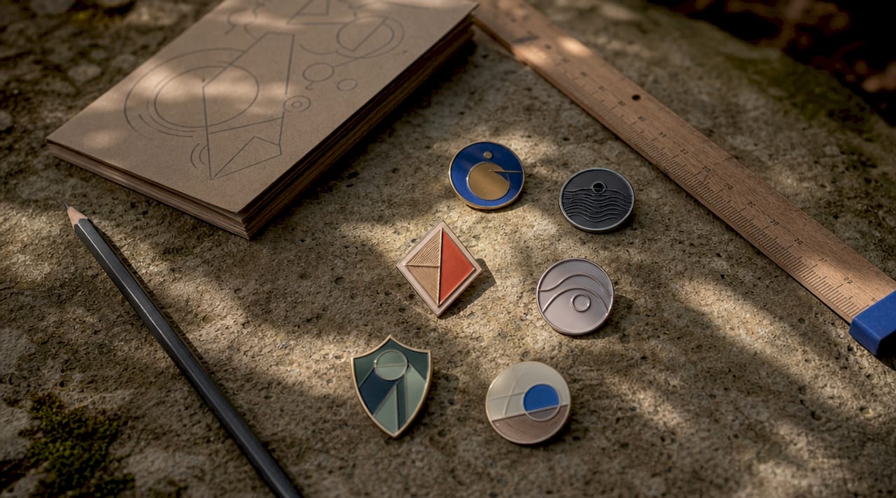
Typography
Typography on badges is often curved along the container boundary, which introduces a specific technical challenge. When text follows a circular path, letter spacing that looks correct on a straight baseline becomes uneven. Manual kerning and tracking adjustments are not optional at this stage. They are what separates a professional result from an amateur one. Sans-serif typefaces tend to perform better at small sizes, while serif fonts can add gravitas to formal or heritage-oriented badge concepts.
Colour and contrast
Limiting colour palettes to 2 to 4 colours and avoiding complex effects like gradients improves scalability and digital performance. For accessibility, a minimum contrast ratio of 4.5:1 for standard text and 3:1 for large text is the accepted standard. These are not arbitrary numbers. They reflect the point at which text becomes reliably legible for people with reduced contrast sensitivity.
Simplicity and scalability
A badge that looks impressive at A4 size but collapses into an unreadable blob at 64 pixels has failed its primary purpose. Simplicity is the mechanism that preserves legibility across scales.
- Use bold, clean silhouettes rather than intricate linework
- Restrict fine detail to the central icon, not the border text
- Test the design at thumbnail size before finalising any version
- Avoid drop shadows, bevels, and gradient fills in the primary version
Pro Tip: Build a simplified, high-contrast version of your badge specifically for small-scale use. This is not a compromise. It is a professional deliverable.
How do different types of badge designs compare?
Not all badges serve the same purpose, and choosing the wrong type for a given context produces designs that feel out of place. Here is how the main categories compare.
| Badge type | Primary purpose | Typical style | Key consideration |
|---|---|---|---|
| Emblem/brand badge | Brand identity | Ornate or flat, unified shape | Must scale to favicon size |
| Digital achievement badge | Credential verification | Clean, flat, icon-led | Requires embedded metadata |
| Event badge | Attendee identification | High contrast, large text | Legibility at arm’s length |
| Product/retail badge | Promotional labelling | Bold colour, short copy | Print reproduction accuracy |
| Personal/hobby badge | Creative expression | Flexible, style-led | Audience and context dependent |
Emblem and brand badges are the most technically demanding. They must work across print, digital, embroidery, and engraving. A badge designed only for screen will often fail when applied to a physical product.
Digital achievement badges, as used by platforms like Credly and issued under the Open Badges standard, carry a layer of complexity that purely visual badges do not. A badge is a combination of visual identity and embedded metadata that proves the achievement’s validity, issuer, criteria, and date. The visual design is the billboard. The metadata is the contract. Neglecting either one produces a credential that looks good but cannot be trusted.
Event badges have their own discipline. Sans-serif fonts, large first names, and limited colour palettes are the standard approach because event badges must be read quickly, often at a distance, under variable lighting. Colour coding by attendee category (speaker, delegate, exhibitor) adds a navigation layer that reduces friction at busy venues.
Pro Tip: When designing for physical badge production, always request a printed proof before approving a final run. Colours shift between screen and print, and what looks vibrant on a monitor can appear flat on a sublimated or embossed surface.
Modern styling trends favour flat design and monoline illustration over the ornate, heavily shadowed styles that dominated badge design in the early 2000s. Clean, flat design with monoline illustrations avoids visual clutter and performs better across digital platforms. That said, heritage brands and craft industries often retain ornate styling deliberately, because the complexity signals tradition and craftsmanship. The choice between modern and traditional is always contextual.
How to create badge designs: a practical process
Creating a badge design that holds up across contexts requires a structured approach. Improvising in software without a clear plan produces designs that look inconsistent and are difficult to reproduce.
- Sketch the concept on paper first. Work out the relationship between the icon, the text, and the container shape before opening any software. Paper sketches are faster to iterate and prevent premature attachment to a digital version.
- Select your brand palette and limit it. Decide on your 2 to 4 colours before you begin building. Colour decisions made mid-design tend to accumulate into palettes that are too complex to reproduce reliably.
- Build on a square canvas with safe margins. A square artboard ensures the badge works as a social media avatar, a favicon, and a print asset without cropping issues. Leave a margin of at least 10% on all sides to prevent the design from feeling cramped.
- Layer the elements in order: container shape, central icon, border text. This sequence keeps the hierarchy clear and makes adjustments easier at each stage.
- Apply manual kerning to any curved text. Do not rely on automatic spacing. Check each letter pair individually, particularly where the curve is tightest.
- Run the thumbnail test. Reduce the design to 64x64 pixels and assess whether the core message is still readable. If it is not, simplify. Simplified badge versions that maintain silhouette and legibility at small scales are a professional standard, not an afterthought.
- Export in the correct formats. Professional digital badges should be exported as square PNG or SVG files at a minimum of 600x600 pixels. SVG is preferable for any context where the badge will be scaled, as it remains crisp at any size.
- Add metadata for digital credentials. If the badge is a digital achievement credential, embed the issuer, recipient, criteria, and date using the Open Badges standard. Embedding a public verification URL behind a digital badge ensures brand trust and easy validation by recipients.
Pro Tip: Save a master version in SVG format with all layers intact. This is your source file. Export all other formats from this single source to maintain consistency across every application.
For physical badge production, the design process extends into material and print considerations. Sublimation printing, for example, requires artwork with a higher colour saturation than screen-optimised designs, because the transfer process slightly mutes colours during application. Knowing your production method before finalising the design prevents costly reprints.
Common challenges and expert tips for professional-quality results
Even experienced designers encounter predictable problems with badge design. Knowing where the pitfalls are makes them easier to avoid.
- Loss of detail at small sizes. The fix is not to make the badge bigger. It is to design a simplified version from the outset, with bolder lines and fewer elements.
- Unreadable curved text. Typography must follow the shape’s contours with careful attention to kerning and letter spacing. A common error is setting curved text and accepting the default spacing, which produces uneven gaps that read as amateur.
- Insufficient contrast. Decorative colour combinations that look attractive at full size often fail accessibility standards. Test contrast ratios using tools like the WebAIM Contrast Checker before finalising any colour pairing.
- Overcomplication. The temptation to add more detail to justify the design’s complexity is one of the most common errors in badge work. Restraint is a skill.
- Missing metadata on digital badges. Digital badge validity depends fully on embedded metadata. Without issuer, recipient, and criteria data, the badge is merely an icon with no credential value.
“Badge design is both art and science; the image is the instant recognition billboard while metadata serves as the contract conveying authenticity.” Sertifier
Personalisation is an underused tool in badge design. A badge that acknowledges a specific achievement, includes the recipient’s name, or reflects the visual language of a community creates an emotional connection that generic designs cannot. For hobbyists producing custom badges for events or personal projects, this personalisation is often the entire point.
Key takeaways
Badge design succeeds when it combines a clear visual hierarchy, a limited colour palette, scalable typography, and, for digital credentials, properly embedded metadata.
| Point | Details |
|---|---|
| Shape carries meaning | Choose circle, shield, or diamond based on the emotional tone you want to convey. |
| Colour limits improve performance | Restrict palettes to 2 to 4 colours and maintain a 4.5:1 contrast ratio for legibility. |
| Scalability is non-negotiable | Design a simplified version that passes the 64x64 pixel thumbnail test. |
| Metadata makes digital badges credible | Without embedded issuer and criteria data, a digital badge has no verifiable value. |
| Export format matters | Use SVG or PNG at 600x600 pixels minimum for professional digital badge output. |
Why badge design deserves more respect than it gets
Badge design sits at an intersection that most designers underestimate. It demands typographic precision, colour theory, iconographic clarity, and, increasingly, an understanding of digital credentialing standards. I have seen experienced designers treat badge work as a quick job, something to knock out in an afternoon, and the results always show it.
What changed my thinking was working on a series of digital achievement badges for a professional training programme. The visual design was straightforward. The metadata layer was not. Getting the Open Badges structure right, with verified issuer URLs, recipient identifiers, and criteria pages, took longer than the design itself. But when recipients shared those badges on LinkedIn and employers could click through to verify them instantly, the value of that invisible layer became obvious.
The other thing I would push back on is the idea that simplicity means less work. A badge that reads clearly at 16 pixels and still looks authoritative at A2 print size has been through more iterations than a complex one. Simplicity is the result of editing, not the absence of effort. If you are a hobbyist just starting out, do not be discouraged by how clean professional badge work looks. That cleanliness is earned, not assumed.
Explore how custom badge design builds brand identity to see how these principles translate into real-world applications.
— chris
Bring your badge designs to life with Subliblanks
Once your badge design is finalised, the quality of your printed output depends entirely on the materials you use.
Subliblanks supplies professional-grade sublimation paper and badge-making equipment with no minimum order quantities, making it practical for designers and hobbyists to produce short runs without waste. The SubliFlex pre-cut sublimation paper is engineered for sharp colour transfer, which means your carefully chosen palette reproduces accurately on the finished badge. For larger format badge artwork, the A3 SubliFlex sublimation paper handles detailed designs with consistent results. Browse the full range of badge making supplies at Subliblanks to find everything you need to move from screen to physical product.
FAQ
What is the difference between a badge and a logo?
A badge integrates text and imagery within a single container shape, making the two elements inseparable. A logo can be a standalone wordmark, icon, or combination mark where elements are used independently.
What file format should I use for a digital badge?
Export digital badges as PNG or SVG files at a minimum of 600x600 pixels. SVG is preferable for scalable use, while PNG works well for fixed-size digital applications.
How many colours should a badge design use?
Limit badge colour palettes to 2 to 4 colours. Restricting the palette improves scalability, print reproduction, and digital performance across platforms.
What is the Open Badges standard?
Open Badges is a metadata framework that embeds issuer, recipient, criteria, and date information into a digital badge image, making the credential independently verifiable by anyone who receives it.
How do I test whether my badge design works at small sizes?
Reduce the design to 64x64 pixels and check whether the core icon and any essential text remain legible. If they do not, simplify the design by removing fine detail and increasing contrast.


