



Fixing sublimation colour: your first-attempt guide to accuracy
Install a matching ICC profile and let only one component manage colour. That single fix solves most sublimation colour problems, and it takes ten minutes to check.
Before touching anything else, run three checks. Print a small colour patch and press it onto your blank, then compare it against the original file. Confirm your design file is set to RGB, not CMYK. Run a nozzle check to rule out a mechanical problem masquerading as a colour one.
- Print a test patch and press it before adjusting anything else
- Set your design software to RGB mode
- Run a printer nozzle check to eliminate clogs as the culprit
Here’s why this matters: your screen creates colour with emitted RGB light, but sublimation ink shifts hue and saturation once heat pushes it into the polyester coating. An ICC profile is the translation layer between what you see and what comes out of the press. Skip it, or run two colour-managing components at once, and you get the classic complaints: reds turning orange, blues turning purple, or prints that look flat and lifeless no matter how vivid the original file was.
Key Takeaways
Accurate sublimation colour comes from managing colour in exactly one place, using RGB files, and standardising every substrate and press variable before blaming the profile.
| Point | Details |
|---|---|
| Manage colour once | Choose either the application or the printer driver to manage colour, never both. |
| Design in RGB | Use sRGB or Adobe RGB files and let the ICC profile handle conversion for printing. |
| Test before scaling | Print and press a small colour chart before committing to a full production run. |
| Lock your variables | Fix ink, paper brand, and press settings first, then reprofile only if colours still drift. |
| Start with consistent supplies | Subliblanks’ blanks and printers reduce the variables you need to troubleshoot from day one. |
Table of Contents
- What is sublimation colour management and why does it matter?
- Do you need an ICC profile? A quick decision checklist
- RGB vs CMYK: which colour space should you actually use?
- How to install and apply ICC profiles without double colour management
- Monitor and printer calibration: soft-proofing and daily checks
- Substrate, paper and press variables that quietly change your colour
- Troubleshooting quick-reference: symptoms, causes and fixes
- When to invest in custom profiles, RIP software and measurement tools
- How to build a simple colour chart for repeatable results
- Understanding colour gamuts and why they limit sublimation accuracy
- Common pitfalls in sublimation colour management and how to avoid them
- A beginner’s honest look at where colour management goes wrong
- Getting your equipment right from the start
- Sources
What is sublimation colour management and why does it matter?
Sublimation colour management is the process of controlling every step between your screen and your pressed blank so the final colour matches what you designed. The tool that does the heavy lifting is the ICC profile, a small file that maps how a specific combination of printer, ink and paper reproduces colour.
Think of it as a translator sitting between three different languages: your monitor’s RGB light, your printer’s ink output, and the way that ink behaves once heat drives it into a substrate. Without a profile, the printer guesses, and guessing produces the murky, shifted colours beginners complain about most.
Sublimation profiles carry extra weight compared with regular inkjet profiles because colour changes happen during the transfer itself, not just on the printed paper. Professional profiling accounts for this by measuring colour with a spectrophotometer after pressing, not before, because dye sublimation ink behaves differently once it moves from solid to gas and bonds with polyester fibres.
- A generic vendor ICC profile often gets most of the way there on standard sublimation blanks
- Custom profiling closes the remaining gap when contract-accurate colour matters, or when you switch ink brands, paper stock, or substrates
Sasson’s rule of thumb still holds: a standard profile works fine until your substrate, ink, or paper changes. At that point the profile you were relying on is measuring the wrong thing.
Do you need an ICC profile? A quick decision checklist
Not every hobbyist needs to profile immediately. Work through this order:
- Lock your variables first. Fix your ink, paper brand, and press settings (time, temperature, pressure) before blaming colour management.
- Check if you’re using third-party or refilled ink. Generic ink with no matching profile is the single biggest cause of unpredictable colour in home setups.
- Test with the vendor-supplied profile. Many dedicated sublimation printers and bundled software already handle this reasonably well.
- Reassess only if colours still drift after pressing with everything else locked down. That is when custom profiling earns its cost.
RGB vs CMYK: which colour space should you actually use?
Design in RGB, specifically sRGB or Adobe RGB, and let the ICC profile handle the conversion to your printer’s space. This single decision prevents more colour disasters than almost anything else on this list.
CMYK files tend to print dark, muddy, and desaturated in sublimation workflows because the profile expects RGB input and the conversion math gets confused when you feed it CMYK values already baked into the file.
- Save and export designs in RGB, never CMYK, for sublimation work
- Use Perceptual rendering intent for photographs, where smooth gradients and overall look matter more than pinpoint accuracy
- Use Relative Colorimetric rendering intent for logos, flat brand colours, and anything needing exact colour matching
- Avoid flattening files to CMYK “just to be safe” — it does the opposite
How to install and apply ICC profiles without double colour management
Getting the profile onto your system is the easy part. Applying it correctly, and only once, is where most beginners trip up.
On Windows: Download the ICC profile from your ink or printer manufacturer, right click it, and select “Install Profile.” It lands in the Windows colour system automatically. In Photoshop, go to Edit > Color Settings and confirm your working space, then select the profile in your Print dialogue under Color Management, setting Photoshop to manage colours.
On Mac: Drop the profile into ~/Library/ColorSync/Profiles. In Photoshop’s print dialogue, you can either let Photoshop manage colours (same as Windows) or let the printer driver manage colours through ColorSync, provided the app is set to “Printer Manages Colours” to match.
- Install the correct ICC profile for your printer and ink brand
- Choose exactly one colour-managing component: the app or the driver
- If the app manages colour, set the driver to No Colour Adjustment
- If the driver manages colour, set the app to Printer Manages Colours
- Print a test patch, press it, and compare against your screen
The golden rule of sublimation colour management is that only one component gets to touch colour at any given time. Enable both the application’s profile and the driver’s colour adjustment, and you get double colour management, which almost always produces washed out or badly shifted results.
Pro Tip: If your prints look oddly pale after pressing but vivid on paper, check your driver settings first. It’s usually double colour management, not a bad profile.
Monitor and printer calibration: soft-proofing and daily checks
Your monitor is lying to you if it isn’t calibrated, and no ICC profile can fix a screen that’s already showing you the wrong colour.
A hardware colourimeter, clipped to your screen for a few minutes, corrects this and should be run monthly. Calibrating your monitor and soft-proofing before you print lets you preview which colours will fall outside your printer’s gamut, shown as flagged or muted areas in Photoshop or Affinity Photo’s soft-proof view, before you waste paper and ink finding out the hard way.
- Calibrate your monitor with a hardware colourimeter, not by eye
- Turn on soft-proofing in Photoshop (View > Proof Setup > Custom) using your printer’s ICC profile
- Print a nozzle check and a small colour patch at the start of every session, not just when something looks wrong
Pro Tip: Keep a small laminated colour card by your press. Comparing it against fresh prints takes seconds and catches drift before it ruins a full batch.
Substrate, paper and press variables that quietly change your colour
The profile only works if everything downstream behaves consistently, and paper, blanks, and press settings are where consistency quietly falls apart.
Substrate content changes how much dye a blank absorbs. Higher polyester content and correctly coated hard surfaces (mugs, metal, tiles) hold colour more predictably than blends or poor-quality coatings, which is why the blank you choose matters as much as the profile you install.
- Print on the correct side of your sublimation paper and set the correct paper type in the driver, since selecting Plain Paper instead of a premium presentation setting is a common cause of faded prints
- Confirm actual press temperature with an infrared thermometer rather than trusting the display
- Keep a simple log of time, temperature, and pressure for every batch so you can trace colour drift back to a specific change
Troubleshooting quick-reference: symptoms, causes and fixes
Most colour complaints fall into a handful of repeatable patterns. Here’s a working diagnostic table you can return to whenever something looks off.
| Symptom | Likely cause | Quick fix |
|---|---|---|
| Reds print as orange | Wrong or missing ICC profile, driver colour adjustment left on | Install ink-brand ICC profile, set driver to No Colour Adjustment |
| Blues shift to purple | Double colour management (app and driver both adjusting) | Choose one colour-managing component only |
| Faded, dull, washed-out prints | Paper type set to Plain Paper, or low ink levels | Switch to Premium Presentation Matte setting, check ink levels |
| Inconsistent colour between batches | No process log, press temperature drifting | Log time, temp and pressure; verify temp with an IR thermometer |
| Banding or streaks | Clogged nozzles, low print quality setting | Run a nozzle check and head cleaning, raise print quality |
Most of these fixes trace back to two root causes: a missing or wrong ICC profile, or a driver setting fighting the application for control. Reprofile whenever you change ink brand, paper stock, or print head, since any of those three invalidates the mapping your current profile relies on.
When to invest in custom profiles, RIP software and measurement tools
Vendor ICC profiles and disciplined process control solve the majority of hobbyist colour problems. Custom profiling and RIP software solve the rest, at a real cost.
Building a custom profile means printing a linearised colour chart, pressing it onto your actual substrate, then measuring the pressed result with a spectrophotometer, because sublimation ink changes behaviour again as it moves from paper to fabric or coating under heat.
- Custom profiling accounts for your exact ink, paper, substrate, and press combination, which vendor profiles can’t fully anticipate
- RIP software such as CADLink, Ergosoft, Wasatch, or ONYX typically costs in the low thousands, reflecting the added colour control, batch nesting, and queuing features aimed at higher volume shops
- Test with a vendor-supplied profile and tight process control first, then move to custom profiling only when a contract demands exact colour matching or your order volume justifies the spend
How to build a simple colour chart for repeatable results
A colour chart is the single best tool for catching drift before it ruins a production run, and you don’t need expensive equipment to build a basic one.
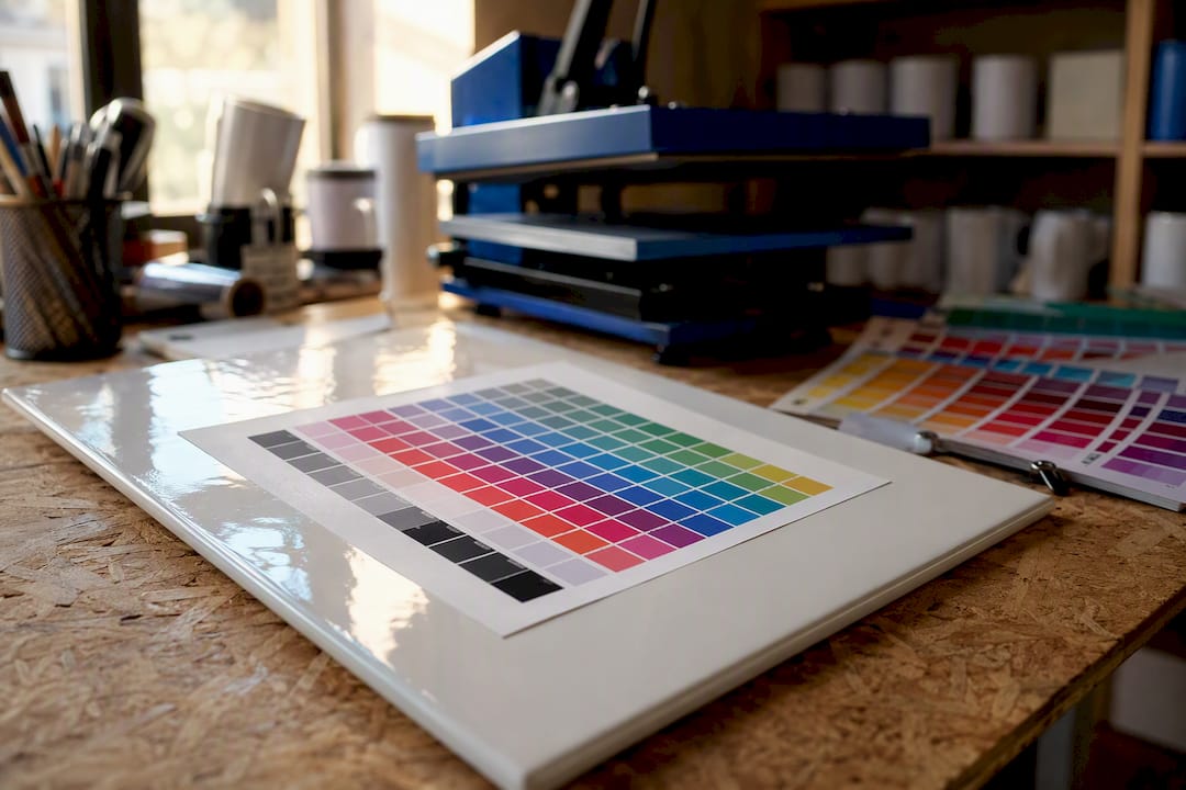
Start by creating a grid in your design software: rows of primary colours (pure red, green, blue), secondary mixes, a greyscale ramp from black to white, and a few skin tone approximations if you print portraits or apparel. Fifteen to twenty-five patches is plenty for a hobbyist chart. Label each patch with its RGB values directly in the design so you can reference them later without guessing.
Print the chart using your standard settings, exactly as you would any other job, then press it onto the same substrate you use for real orders. Compare the pressed result against your on-screen values, patch by patch. Where you see a consistent shift, say every red patch pressing slightly orange, that tells you something about your current profile or process rather than a one-off mistake.
Keep this chart and repeat the test any time you change ink, paper, or blank supplier. Store the pressed chart somewhere you can grab it quickly, next to your press if possible, and use it as your reference every time a print looks “off” but you can’t immediately say why. This turns a vague complaint like “the colours look wrong” into a specific, traceable comparison.
A chart pressed today and one pressed in three months, using identical settings, should match closely. If they don’t, something in your process has drifted, and you’ll catch it before an entire order goes wrong instead of after.
Understanding colour gamuts and why they limit sublimation accuracy
A colour gamut is the full range of colours a device can actually produce, and sublimation printers can’t reproduce everything your monitor can display.
Your screen generates colour with emitted light, which lets it produce extremely bright, saturated colours, especially in neon greens, electric blues, and certain fluorescent tones. Sublimation ink, sprayed onto paper and then heat-transferred into a substrate, works within a narrower range. Certain saturated blues and greens sit outside what any sublimation printer can physically reproduce, no matter how good your profile is.
This is why soft-proofing matters so much. When you soft-proof a design against your printer’s ICC profile, out-of-gamut colours get flagged, usually shown as a slightly muted or shifted version of the original. Seeing that warning before you print tells you the design needs adjusting, or that you should accept the closest achievable match, rather than being surprised by a dull result after you’ve already used a blank.
Gamut limitations also explain why two different printers, even with correct profiles installed on both, can produce visibly different results from the same file. Each printer, ink, and paper combination has its own gamut boundary. A profile maps your design as accurately as possible within that boundary, but it can’t stretch the boundary itself. Understanding this stops you chasing an impossible match and instead helps you pick designs and colour choices that sit comfortably within what your specific setup can actually achieve.

Common pitfalls in sublimation colour management and how to avoid them
Most sublimation colour problems trace back to a small handful of repeated mistakes, and recognising them saves hours of frustrated troubleshooting.
The most common pitfall is running double colour management, letting both the design application and the printer driver try to adjust colour at the same time. This produces washed-out, unpredictable results that look like a profile problem but are actually a settings conflict. The fix is always the same: pick one component to manage colour and switch the other off completely.
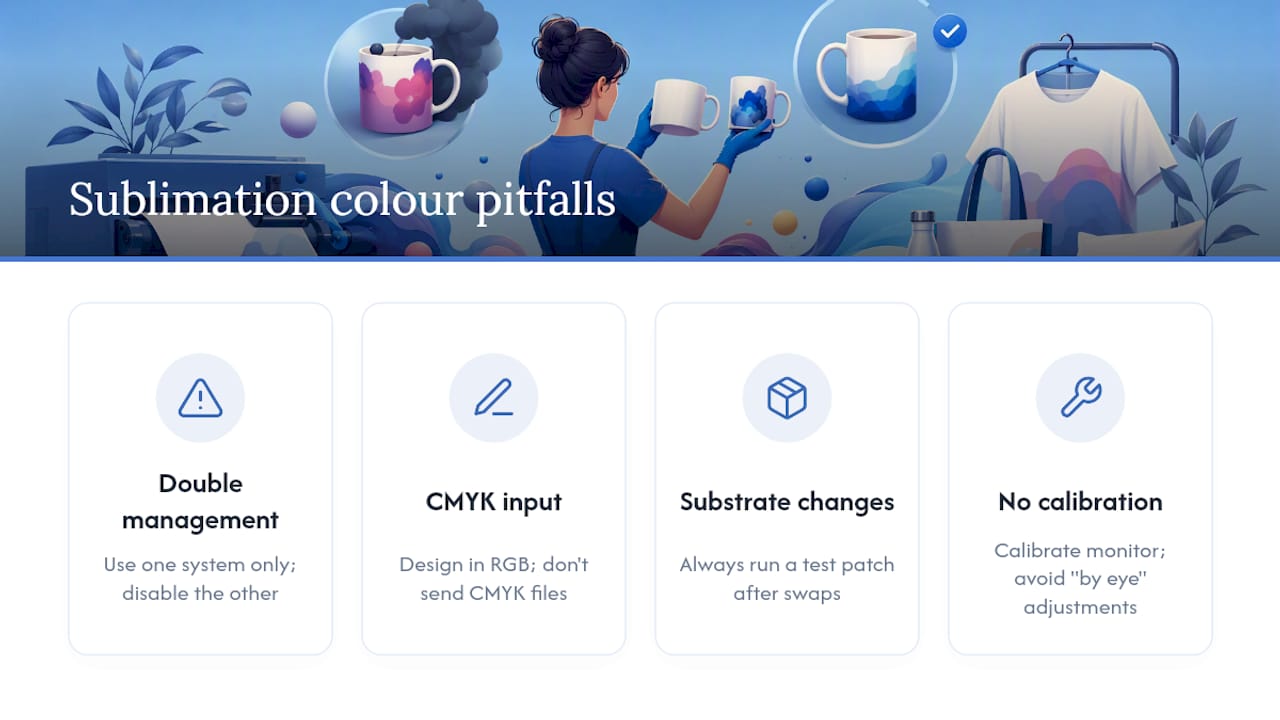
The second pitfall is designing in CMYK out of old habit from offset printing experience, then wondering why sublimation prints come out dark and muddy. Sublimation workflows expect RGB input, and feeding them CMYK values confuses the profile’s conversion math.
A third common mistake is changing one variable, a new paper brand, a different ink cartridge, a new blank supplier, without retesting. A profile built for your old paper doesn’t automatically work for the new one, even if the two look similar in the packaging. Every substrate and paper swap deserves a fresh test patch before you commit to a full order.
Finally, many beginners skip monitor calibration entirely and just adjust colours “by eye” on an uncalibrated screen. This creates a moving target: the profile might be doing its job perfectly, but your monitor is showing you inaccurate colour to judge it against, so you end up chasing a problem that doesn’t actually exist in the print.
A beginner’s honest look at where colour management goes wrong
Most beginners don’t fail because they skip ICC profiles entirely. They fail because they install a profile, then leave the driver’s own colour correction switched on as a safety net, not realising the two are now fighting each other. That single overlap causes more washed-out, orange-tinted disasters than a missing profile ever does.
The other shortcut worth taking early: build your colour chart before your first paying order, not after your third complaint. It costs one sheet of paper and ten minutes, and it turns guesswork into a fixable, traceable process. For a full walkthrough of profile installation, our ICC profile setup guide covers each step in more detail than space allows here.
Author bio and credentials to be added by publisher.
— chris
Getting your equipment right from the start
Half the colour problems beginners chase for weeks trace back to inconsistent blanks or mismatched paper, not the profile at all. Subliblanks supplies sublimation blanks, printers, and paper as a trade wholesaler with no minimum order quantity, which means you can test a specific blank and paper combination properly before committing to a full production run.

If you’re setting up from scratch, the Epson and Ricoh sublimation printer collection is a sensible starting point, since these printers pair well with the ICC workflows covered above and give you a stable base to profile against. Pair that with consistent blanks from the same supplier batch and you remove one of the biggest variables in the entire troubleshooting table. Browse the full product range and order exactly what you need to build your first test kit, no bulk commitment required.
Sources
- Sublimation color management | Impressions
- Sublimation ICC Profile: Setup, Workflow & Color Fixes | SublimationGuides
Recommended
- ICC profiles for sublimation: your complete setup guide – SubliBlanks Ltd
- Sublimation Printer Setup Guide for Small Businesses – SubliBlanks Ltd
- Sublimation Transfer Process: Achieve Professional Prints Easily – SubliBlanks Ltd
- Sublimation Printing Step by Step for Personalised Goods – SubliBlanks Ltd


